Wednesday 30 December 2009

Friday 25 December 2009
recent things
pleased with how things are going at the moment. art wise feel much clearer. Time away from rest of the world is hard but does make a difference.


this is only part of it - as i couldn't fit all of it onto the scanner but it communicates enough. i liked the curved of the paper and then the stick attachments really worked for me - there are only three which made it super cool.

This is Pia's photo which she gave to me when she left China. I really love it as an object with the removal of the surface at both top and bottom and the slightly folded corners. Feel that it is important

Friday 18 December 2009
straight edges and squared paper
gone back to diagrams again but looking forward to having some more fun photographing them.


Inbetween these works I went back to some hand drawn family tree like diagrams. Can't decide if I want to use serious colour in these or just to stick to greys and creams. Not sure.
sort of feel that I am constantly wobbling between the clinical humanless (but human - a contradition I know but bit like the photorealists in a way) and the fragile falable human line. Also, have same problem with colour - keep wanting to add riotus joyous colour but generally don't like the results - it doesn't have the inside of a church emptiness sort of feel that I want ... most of the time.


Like the contrast between selecting areas of composition for the photos and the page framing things for me in the actual diagrams.
Using a Chinese account book that has lots of rip out pages I have been cutting them up and rearranging them. I see several abstract artists in my head when I make them. Not just Martin but Mondrian too. But, something different from Mondrian. Want to try to add some colour maybe this blue that I keep wanting to use.

Inbetween these works I went back to some hand drawn family tree like diagrams. Can't decide if I want to use serious colour in these or just to stick to greys and creams. Not sure.
sort of feel that I am constantly wobbling between the clinical humanless (but human - a contradition I know but bit like the photorealists in a way) and the fragile falable human line. Also, have same problem with colour - keep wanting to add riotus joyous colour but generally don't like the results - it doesn't have the inside of a church emptiness sort of feel that I want ... most of the time.
Thursday 5 November 2009
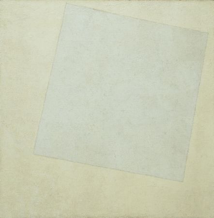
SUPREMATISM ////// \\\\\\\////\\//\\//\\\\.....//..\.,
Really feel happy today as re-looked and thought about Suprematism, specifically Malevich.
 (this is from a blog - personally this one is too colourful for me)
 - from MOMA website (or another blog that got it from there)
(this is from a blog - personally this one is too colourful for me)What I read today - in more a list/note form than formed sentences - but quotes from 'Styles Schools and Movements'
art of pure geometrical abstraction
trying to liberate the world from the ballast of the representational world
supremacy of the world greater than the world of appearances
reception of art was an independent spiritual activity, not political, utilitarian or for social purposes
'sensation of infinity'
creating and illusion of space and movement as the elements seem to float in front of the canvas
I am particularily interested in the white on white series - for the floatingness.
- from MOMA website (or another blog that got it from there)I'm interested in this extremely sensitivity, banality, where nothing is done but so much is said. There is something really important, to me, about this cool white on the warm ground. The other way around isn't the same at all.
Well what I am getting at is..... this play with surface, pure geometry is something that I am doing in the installations, in the diagrams + with the photographs. I feel that Suprematism is a sort of anchor to my practice - stopping me from going off too far on wild overly imaginative jaunts (which I have a tendency to do do). I don't feel that my work is just about geometry, it is about reducing words and symbols to the level of geometry, about leading the viewer into it and leaving them no where.
todays lines and more lines and some rectangles


Today, like yesterday I was struck by how much I liked the debris around rubbed out pencils lines, or just the effect before you brush away or the tiny pieces of used up rubber. Sort of reminds me of ploughed fields.
Went on to do lots of lines. Trying to generate space, but a subtly too. Not such much vanishing point but lines going across akin to lined paper, but not as regular. Keep thinking of SciFi movies for some reason. Anyway partly pleased with todays piece. Again I am going back to diagrams on paper as apposed to works that are purely photographs in their own right.


Though these look perspectival, the camera is just on the surface paper. The work is just lines going across the page with a rectangle or a square at each lines end.
Rather liked the white on the cream paper. The white paint that I have isn't white enough for my white paper, comes out cream and not the coolness that I want. On cream paper it works fine. This moves me on nicely to my next post.
Monday 5 October 2009
ground - over ground + underground (plus scoring)
Today was quite productive. I didn't make anything that made me go wow but I feel as if I was able to clarify some things. I think I'm trying to play with plans of colour / tone generating depth like Rothko did but do it in photography too. I found this by cutting sections out and then overlaying them on other colours but it wasn't enough. It was much better where there were more layers or that the colour underneath was also above.


I got into cutting into shapes where the inside dictated the outside. But, still with the same arrangement liked the architectural landscape view as well as the top down flat abstract plan view. Can't figure that out or whether I have to (decide on one or the other).


Then I got really into the black paper and started scoring into the paper. I liked how these lines were not physical and easier to see when photographing along the surface of the paper. I worked on top with pencil small squares. It was cool because I was into them as objects, the photography had inspired the actual diagram as apposed to the other way around - making something to be photographed. The black paper diagram curvy line thing was really cool because in the light it changed, you had to hold and move it to see what was good about it - it would be crap in a frame. Would be good on the floor where you could walk around it.


Also been reading a lot of Flusser today - but more on that another day.......... tbc perpetually.....
Progress

I have been checking out Paul Sietsema's images on the internet. I saw and really liked one of his videos at the Berlin Beinialle last year. I couldn't see enough of his drawings, but liked the simplicity of them, and the foundness of them. Still feel that I have something different to contribute. Though I like found stuff, sometimes I find the sentimentality attached to them an aesthetic that makes me cringe, and a strange sort of insipid kitsch.
Today is going to be super art day. Mainly going to be cutting things, and less photographing, I think, but I just can't help it, even if the light isn't perfect I still want to photo beautiful arrangements. Looking forward to buying more paper, as today I have to use up all my paper - but in a painfully minimal way that feels that I haven't finished.
Sunday 4 October 2009
Pop Life - personal reflection - (on a review of it)
"Pop Life deserves to be a hit, though, because it tries so hard to get the genie back into the bottle – to distil, as far as possible, a whole chapter of modern times in which a particular kind of art turned itself into pure commodity. " Laura Cumming, Observer Oct 4th
It was so pleasing to read this review. Sorry I haven't seen the exhibition, in the wrong continent, or right one depending on your location and desire to see the show. I was pleased with how, according to the review Pop Art was continued from the historically confirmed Pop Art period of Warhol to the present day Hirst's diamond encrusted skull. It felt good to finally see condensed in words how commodity and commercialism really have been something pervasive and present in the art works produced recently. Personally as an artist I have always found the pressure to brand myself and produce work that fitted nicely into a box frustrating and some how an antithesis to what I considered being an artist involved.
I got tired of the obvious tricks being used in a lot of contemporary art, visual puns that are words based or the blunt conjoining of two things e.g. diamonds and a skull /wealth + death.
"composed of fast art: nothing to detain you for long"
Laura Cumming, Observer Oct 4th
It is about time for something new, something more considered more subtle with an positivity other than wealth seeking. I know the art world is all about money, but for artists like myself who actively decided to stop making artwork that was commercially successful to seek something else (and not the only one), it is about time there was some sort of transition from, or re-equaluation of this, or at least more writing from this point of view. I felt that Cumming's review did acknowledge this. Recently I went to an artists/designers talk, one of the speakers said, no artist now makes art 'after working in the paddy field all day', but in reality the majority of artists I know all have jobs to support their art work. We talk about 'professional artists' where we expect the word professional to mean that they make money from it, we should obviously not consider earning money from their art as validity of their role as an artist in society.
I want to go back to the quote "composed of fast art: nothing to detain you for long". We need to consider how the internet is affecting us, changing us. Personally I love the internet and have to fight off my surfing addiction. As good as it is, our attention spans are changing, we all have ADHD, flicking from one window to the next. I doubt anyone has read to this part of this post (I doubt I would have). Things around us are not faster, our duration of focus has changed. Things are not considered, conversations are text messages. Please don't think of me as an old fuddy duddy conservative seeking stop change at all costs, but think of me as someone who wants you to see slow life - consideration - empty space, as something new that we can earth to allow us to look at the world with fresh eyes.
Friday 2 October 2009
some work today

 This one was just cut up bits of black paper. I was interested in the arrangement and if i up the contrast of the image using photoshop the space or depth would have been flattened more so imperceptable.
  this one really needs to be in a post of its own. It doesn't work surrounded by other images. I like the human quality of these lines, which is a contrast to my normal ruler lines.
 this one i liked because, hopefully at a first glance it is a cross then you can see that the pencil line travels over the paper.


suprematists
Got really into the Suprematists today. I especially liked Malevich's Suprematism with Eight Rectangles because it was so simple and because it has so much potential for my own work. I'm imagining remaking it or many variations by laying red rectangles on a white piece of paper and then photographing it. This way playing with surface and depth.
Monday 28 September 2009
folds and curves
Getting all excited about folded paper and lines going over them today. Printed of Flusser to read - so I can write some thoughts about. Feel good about getting into drawings relationship to photography - the real versus the representation - this works with my installations too so that is cool. Some of today's explorations.


Will need to do some more homework/research on getting my white balance right. Still dealing with some dust on my image sensor - frustrating.
thinking about Richard tuttle too - the wire shadow work - will have to explore this too at somepoint - also want to get a film camera and do some more drawing on the film - it is cheap to do this stuff over here in China :-)
Saturday 19 September 2009
Painting


Wednesday 16 September 2009
yesterday investigations
Still trying to work stuff out. Some images look great as are what they are. Others are about geometric abstraction with or without depth showing plains of surface. IInterested in line. Still need to be much more less than more.


Monday 14 September 2009
abstraction in 3 dimensions
Had a good making day today. Went to art shop and bought some more different kinds of paper so more exploration tomorrow. Really happy about the unresolved problem between the photograph and the object, the drawing, feels great that I have this 'thing' or problem.
I got into cutting holes in paper. I love where I make my art / take photos (same thing) the light is awesome.
 this is one of todays photos.
I was thinking about the shcontemporary art fair today. I like anthony gormleys drawing things, though I get a bit hmm about famous artists who do public art sculptures but i liked his paper stuff. Also another Chinese artist who had done some wonderful pencil diagonal grid lines. I liked them a lot too.
I got into cutting holes in paper. I love where I make my art / take photos (same thing) the light is awesome.

I was thinking about the shcontemporary art fair today. I like anthony gormleys drawing things, though I get a bit hmm about famous artists who do public art sculptures but i liked his paper stuff. Also another Chinese artist who had done some wonderful pencil diagonal grid lines. I liked them a lot too.
Subscribe to:
Posts (Atom)